
A New Look For The ESV Quentel By Schuyler Bibles
The best-selling Quentel series from Schuyler Bibles has long been their signature Bible with a classic style and placing quality over cost. Each Quentel Bible is meticulously crafted with attention to detail, making it a favorite among discerning Bible readers worldwide.
The Quentel pays homage to Peter Quentel, a renowned printer in Cologne, Germany during the early sixteenth century. William Tyndale’s decision to use Quentel’s printing press for the first English translation of the New Testament from the Greek in 1525/1526 speaks volumes about the enduring legacy of the Quentel name. Each page of the Quentel Bible is a testament to the rich history and tradition of fine bookmaking, carrying forward the spirit of excellence established by its namesake.
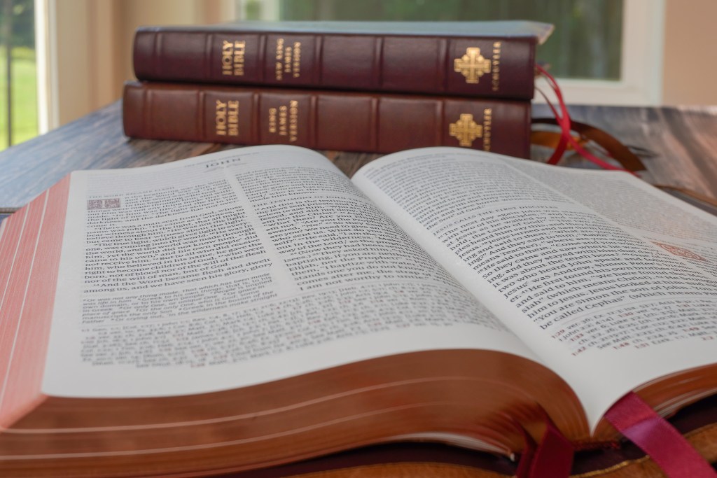
This high-quality double column Bible features the elegant Milo font, crafted in Denmark, and is expertly printed and bound in the Netherlands by Royal Jongbloed. The layout and font make it a pleasure for readers, providing a clean and classic aesthetic that is easy on the eyes.
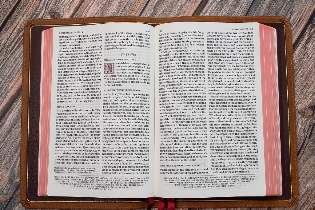
The inclusion of cross-references at the bottom of each page plays a crucial role in ensuring that they do not disrupt the reading experience, allowing the reader to delve into the text without distraction. This strategic placement not only enables easy access to additional information but also enhances the overall flow. Similarly, the translator’s notes, positioned at the bottom but above the references and to the side, offer valuable insights without detracting from the primary content. Their placement ensures that readers can seamlessly access supplemental explanations and clarifications without interruption. This thoughtful layout significantly contributes to the comprehensive and enjoyable consumption of the material.
With this 2024 printing of the English Standard Version, one of the top selling modern English translations, the Quentel has undergone notable changes that elevate its appeal even further. In my opinion, these adjustments have enhanced the classic look of the Quentel, reaffirming its status as a paragon of sophisticated design and unparalleled quality.
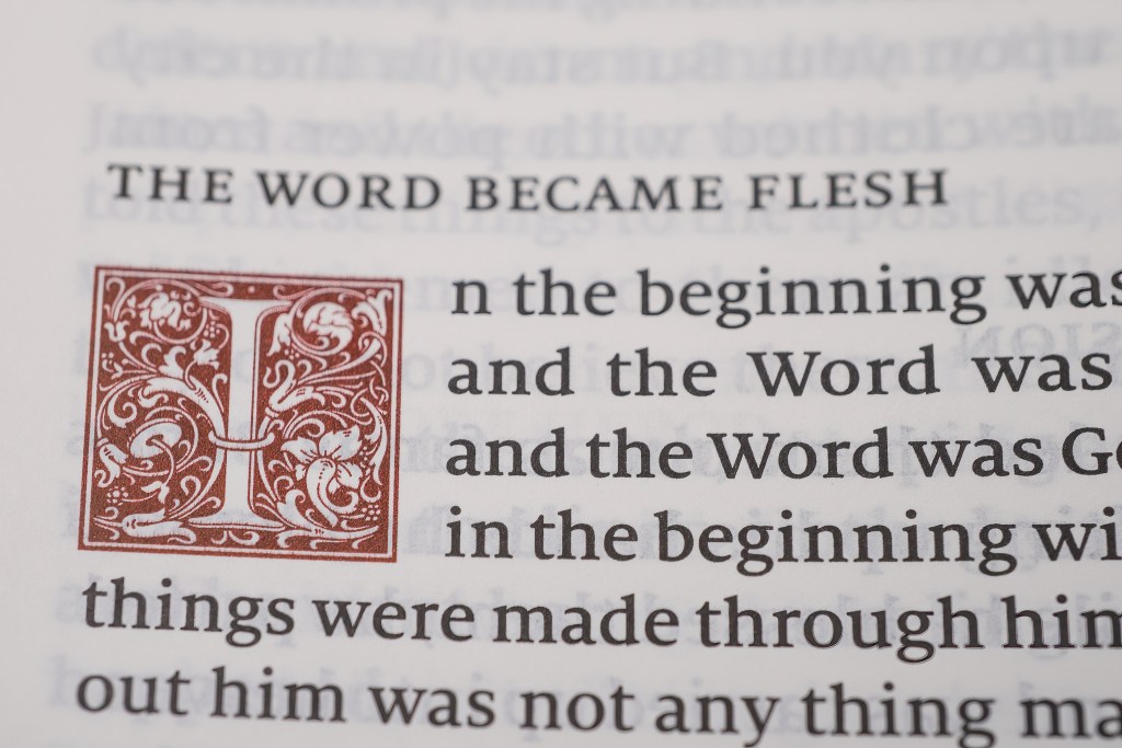
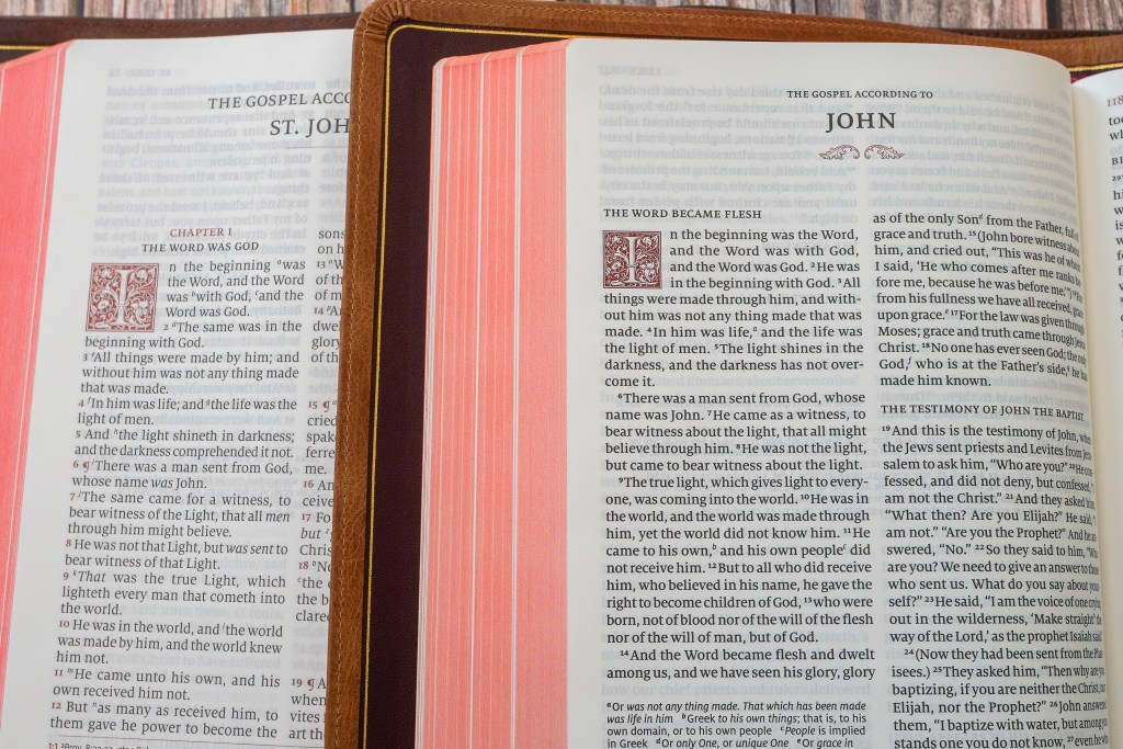
The first notable change is that the new ESV Quentel has included the ornamental drop caps as found in the KJV Canterbury and Treveris, as well as the RSV Quentel, all published by Schuyler. This beautiful addition provides a classical look that enhances the visual quality of the already lovely edition.
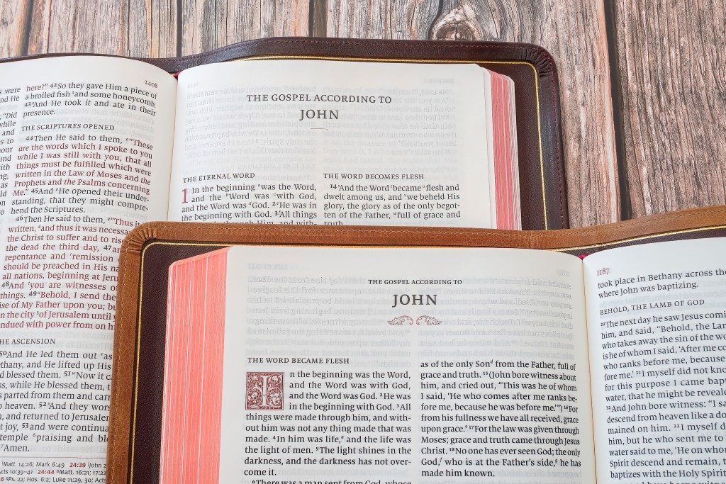
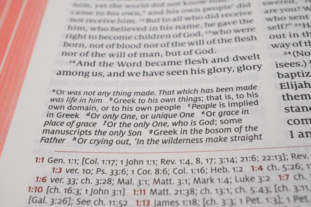
Additionally, the font size has changed. The earlier ESV Quentel had an 11 point Milo font. The newer ESV Quentel now is a 10 point Milo font. While the size is slightly smaller, the black lettering and line matching make it very easy to read. While my 67 year-old-eyes appreciate the 11 point font, the 10 point is still very readable and comfortable. I also should note that while at a 10 point font the letters are a bit darker and bolder lending to its readability, with a slight increase in the white spaces on each page.
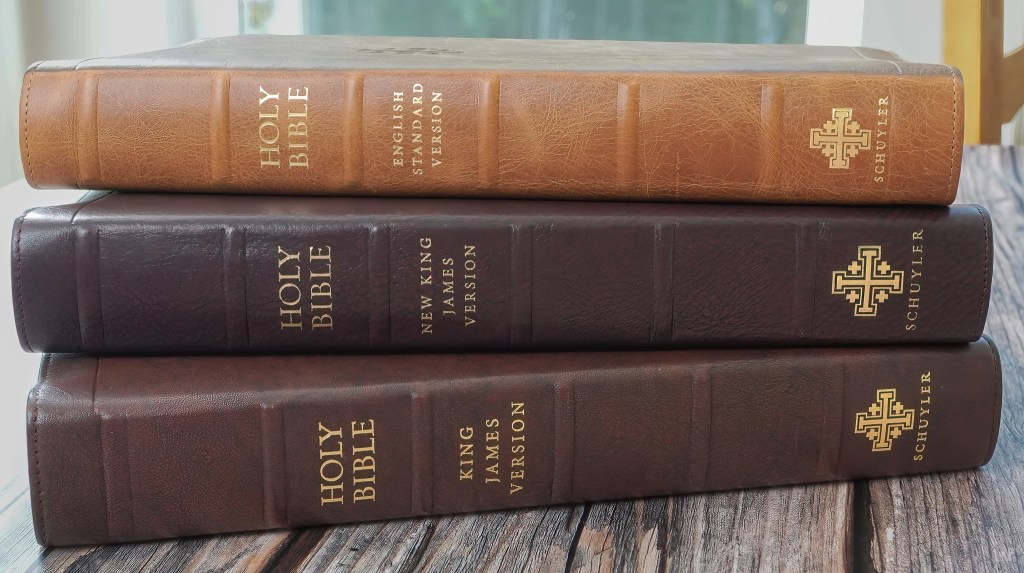
Things that remain the same are the high quality leathers used, the use of Milo font, premium ribbons, a full concordance for the ESV, the same quality opaque paper found in other Schuyler Bibles at 28 GSM French paper with titanium pigments, and the beautiful maps for which Schuyler Bibles are known.
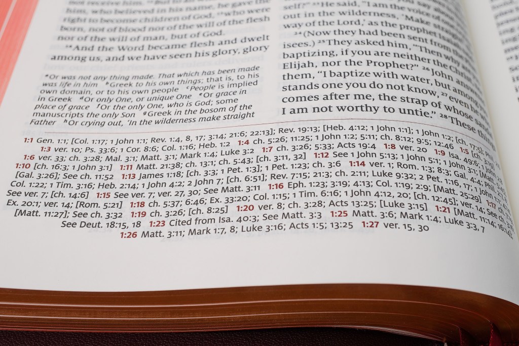
Also, while the cross-references are still there, the numbering for the cross-references has changed. Instead of the small letters within the body of the text after a word indicating a cross-reference, the cross-references are listed with the verses they reference in the footnotes. This removes the unnecessary lettering within the text which can sometimes take away from the reading experience. Now the footnotes lists the verse in the same accent color that highlights the drop caps. To me, this is a wonderful improvement. Likewise, apart from the verse numbers, small letters after a word or verse are references to textual notes from the translators. This allows the reader to also where there are textual or translational differences.
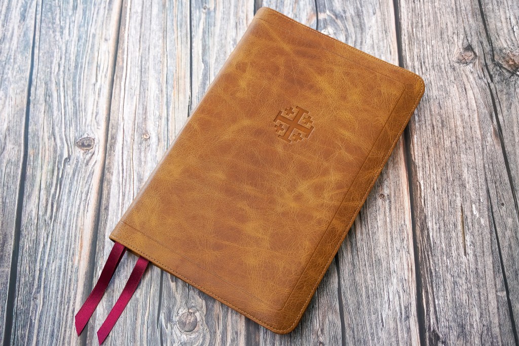
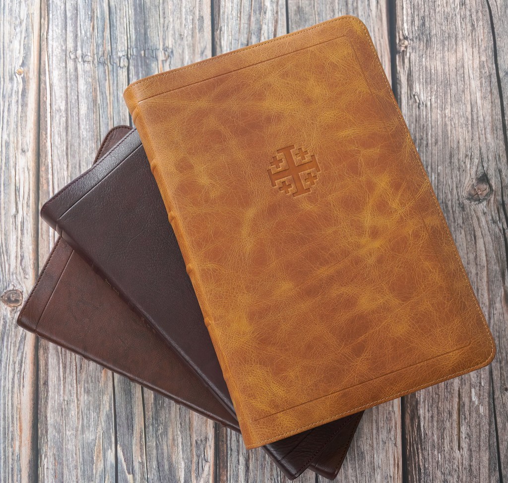
With a new look, new leathers were also introduced for this edition. The well-received Desert Camel (which is the one pictured) in full yapp is amazing. In addition they offer classic Black Goatskin, Dark Purple Goatskin, Olive Green Calfskin, Prussian Blue Calfskin, Black Pearl Calfskin, and Saddle Brown Calfskin (which looks like a finish they will be adding to other Bibles they publish). They also offer ESV Quentel Bibles with the Apocrypha, as well as Credo editions with historic creeds and confessions. There is also a smaller, Personal Size of the Quentel. You can see their current stock here.
If you are looking for a premium Bible, either for yourself or as a gift, that is designed for comfortable reading and will last a lifetime, I highly recommend the Schuyler Quentel. This exquisite Bible offers a delightful reading experience with its high-quality paper, elegant typography, and durable binding. Whether you are a devoted scholar, a religious leader, or simply someone who appreciates fine craftsmanship, the Schuyler Quentel is a testament to meticulous attention to detail and reverence for the sacred text.

Leave a comment